

Data Visualization: The Art of Insight with Expert Resources!
Data has become the lifeblood of modern businesses and organizations. From market trends to customer behavior, data holds invaluable insights that drive strategic decision-making. However, raw data alone can be overwhelming and difficult to interpret. This is where the art of data visualization comes into play.
Introduction
Importance of Data Visualization
In today’s fast-paced world, decision-makers need quick access to actionable insights. information graphics serves as a powerful tool for transforming complex datasets into visually appealing graphics that are easy to understand. By presenting information in a graphical format, data visualization enables stakeholders to grasp concepts, identify patterns, and make informed decisions swiftly.
What is Data Visualization?
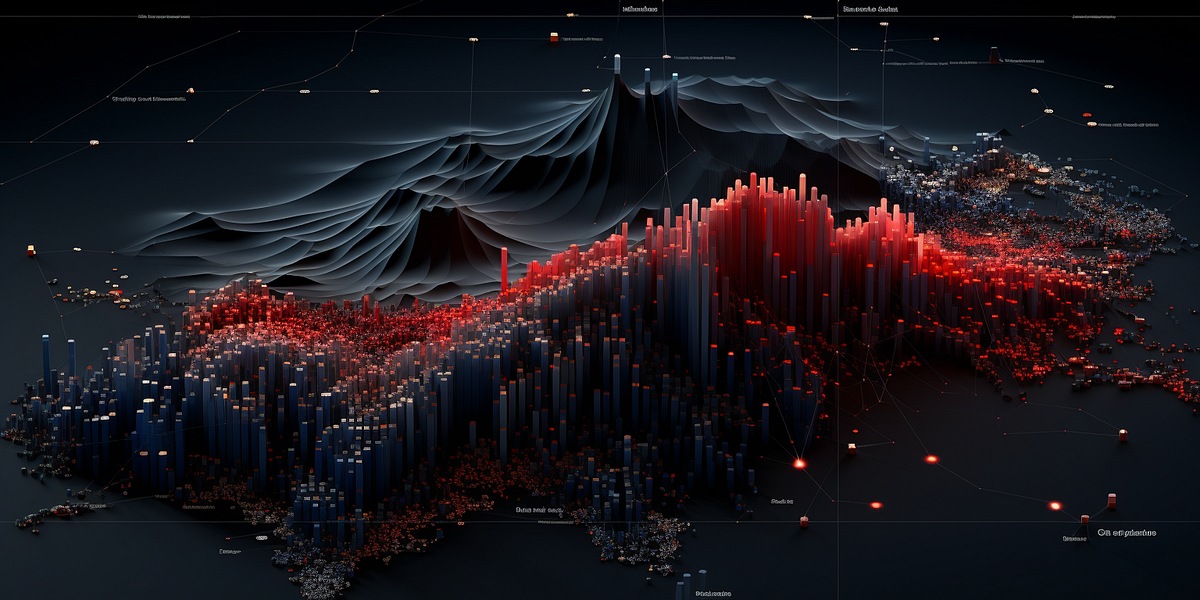
At its core, data visualization involves representing data in graphical or pictorial form. This can include charts, graphs, maps, and infographics, among other visual formats. The goal is to present information in a visually engaging manner that facilitates understanding and analysis.
Understanding the Art of Insight
Data visualization goes beyond merely presenting data—it unlocks insights that may not be immediately apparent from raw numbers alone. By visualizing data, patterns, trends, and correlations become more evident, empowering users to uncover valuable insights that drive innovation and success.
Examples
Consider a sales dashboard that displays revenue trends over time or a geographical heatmap illustrating customer demographics. These visualizations not only provide a snapshot of current performance but also reveal opportunities for growth and optimization.
Principles
Clarity and Simplicity
Effective data visualization prioritizes clarity and simplicity. Avoid cluttering graphs with unnecessary elements and strive for clean, intuitive designs that guide the viewer’s attention to key insights.
Use of Appropriate Charts/Graphs
Different datasets call for different visualization techniques. Whether it’s a line chart, bar graph, or scatter plot, selecting the right type of chart ensures that data is presented in the most informative and understandable manner.
Storytelling Through Data
Great visualization tells a story. By framing data within a narrative context, visualizations become more compelling and memorable, fostering deeper understanding and engagement.
Tools and Resources
Popular Tools
A plethora of tools are available for creating stunning visualizations, from industry standards like Tableau and Power BI to open-source options like Python’s Matplotlib and Seaborn libraries.
Online Resources
For those looking to enhance their information graphics skills, numerous online courses, tutorials, and communities offer valuable insights and guidance. Platforms such as Coursera, Udemy, and YouTube provide accessible resources for learners of all levels.
Mastering Data Techniques
Data Cleaning and Preparation
Before visualization can occur, data must be cleaned and prepared. This involves removing duplicates, handling missing values, and formatting data appropriately to ensure accuracy and consistency.
Choosing the Right Visualization Techniques
Every dataset has its own story to tell, and choosing the right visualization techniques is crucial. Whether it’s a pie chart to show proportions or a bubble chart to illustrate relationships, selecting the appropriate visualization enhances understanding and interpretation.
Interpreting and Communicating Insights
Effective data visualization is not just about creating pretty pictures—it’s about conveying meaningful insights. As such, it’s essential to interpret visualizations accurately and communicate findings clearly to stakeholders.
Expert Tips for Effective Data Visualization
Design Considerations
Pay attention to design principles such as typography, color theory, and layout to create visually appealing and impactful visualizations.
Utilizing Color Effectively
Color plays a significant role in data visualization, aiding in differentiation and highlighting key points. However, misuse of color can lead to confusion, so it’s essential to use it judiciously and purposefully.
Incorporating Interactivity
Interactive visualizations allow users to explore data dynamically, gaining deeper insights through exploration and experimentation. Incorporating features like tooltips, filters, and drill-down capabilities enhances user engagement and understanding.
Case Studies

Real-World Example
Explore case studies from various industries showcasing exemplary data visualization practices and their impact on decision-making and innovation.
Challenges and Pitfalls to Avoid
Common Mistakes in Data Visualization
From misleading charts to overcomplicated designs, there are several pitfalls to avoid in data visualization. Awareness of these common mistakes can help ensure that visualizations are accurate, informative, and impactful.
Addressing Challenges
Overcoming challenges such as data complexity, audience diversity, and tool limitations requires creativity, adaptability, and a deep understanding of both data and visualization principles.
The Future of Data Visualization
As technology continues to advance at a rapid pace, the future of information graphics holds immense promise and potential. With the advent of artificial intelligence and machine learning algorithms, data visualization tools are becoming increasingly sophisticated, capable of handling vast amounts of complex data in real-time.
AI-driven Insights:
Artificial intelligence algorithms will play a pivotal role in extracting actionable insights from large datasets, enabling users to uncover patterns, trends, and correlations with unprecedented speed and accuracy.
Immersive Visualization:
Emerging technologies such as virtual reality (VR) and augmented reality (AR) are revolutionizing the way we interact with data, offering immersive visualization experiences that transcend traditional two-dimensional displays.
Interactive Dashboards:
Interactive dashboards equipped with intuitive user interfaces and customizable features will empower users to explore data dynamically, facilitating deeper analysis and decision-making.
Conclusion
In today’s data-driven world, mastering the art of information graphics is essential for unlocking actionable insights and driving informed decision-making. By adhering to principles of clarity, simplicity, and storytelling, and leveraging expert resources and tools, individuals and organizations can harness the power of information graphics to gain a competitive edge and achieve their goals.